
Product Features
UI Styling
Configure the global visual system of your application, including color, typography, and component styling, with live preview across built pages.
Overview
UI Styling defines the visual system of your application. It controls colors, typography, and component styles that apply consistently across every page generated in your build.
All styling decisions are application-wide. Styles cannot vary by page or component instance.
Where UI Styling Appears
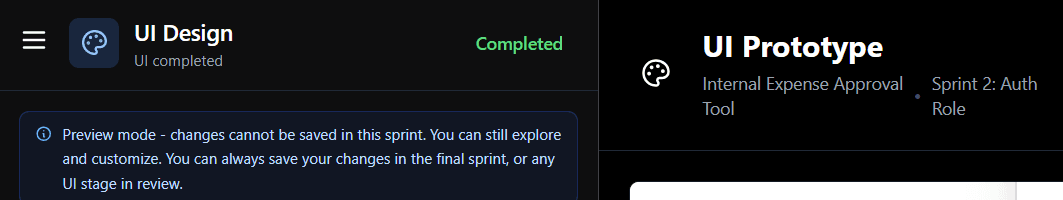
UI Styling is part of the UI stage within each implementation sprint.
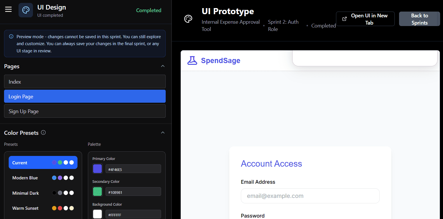
In all sprints except the final one, the editor runs in preview mode. You can explore styling options, but changes cannot be saved.
Final styling decisions must be saved in the last UI sprint.
Previewing Your Changes
The right side of the screen shows a live preview of your application as styling changes are made.
Use the Pages panel to select which page to preview. The listed pages reflect the actual pages built across your sprints.
Changing the selected page affects only the preview context. All styling changes remain global.
Color
Color Presets
Six predefined themes provide structured starting points. The currently active theme appears at the top as Current.
Selecting a preset updates the full palette automatically. Individual values can then be adjusted.
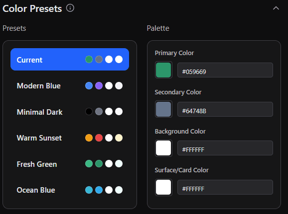
Custom Palette
The palette gives you direct control over four color values:
Primary Color - buttons, links, and key UI elements
Secondary Color - supporting elements and accents
Background Color - base page background
Surface/Card Color - cards, panels, and contained elements
Each value is editable as a hex code, as shown in image above. Changes apply across the entire application.
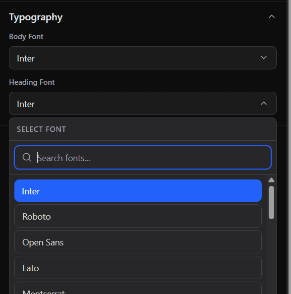
Typography
Typography settings control application text styles:
Body Font - paragraphs, labels, and general interface text
Heading Font - all heading elements
Selected from dropdown menus.
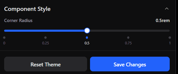
Component Style
Corner Radius
Controls how rounded interface components appear, including buttons and cards. Adjustable via a slider from 0 (sharp corners) to 1rem (fully rounded). The setting applies globally.
Saving and Resetting
Save Changes - applies the current styling configuration. Available only in the final UI sprint. In earlier sprints, the button remains disabled even if changes are made in preview mode. In the final sprint, it activates once changes are detected.
Reset Theme - restores the default visual system and removes customizations.
Related Documentation
Requirements & System Overview - How your initial inputs define the structure and components that styling is applied to
System Design - How approved requirements are translated into the architecture and pages that UI Styling visually formats
Requirements - Defining scope and functionality before visual refinement
Overview
UI Styling defines the visual system of your application. It controls colors, typography, and component styles that apply consistently across every page generated in your build.
All styling decisions are application-wide. Styles cannot vary by page or component instance.
Where UI Styling Appears
UI Styling is part of the UI stage within each implementation sprint.
In all sprints except the final one, the editor runs in preview mode. You can explore styling options, but changes cannot be saved.
Final styling decisions must be saved in the last UI sprint.
Previewing Your Changes
The right side of the screen shows a live preview of your application as styling changes are made.
Use the Pages panel to select which page to preview. The listed pages reflect the actual pages built across your sprints.
Changing the selected page affects only the preview context. All styling changes remain global.
Color
Color Presets
Six predefined themes provide structured starting points. The currently active theme appears at the top as Current.
Selecting a preset updates the full palette automatically. Individual values can then be adjusted.
Custom Palette
The palette gives you direct control over four color values:
Primary Color - buttons, links, and key UI elements
Secondary Color - supporting elements and accents
Background Color - base page background
Surface/Card Color - cards, panels, and contained elements
Each value is editable as a hex code, as shown in image above. Changes apply across the entire application.
Typography
Typography settings control application text styles:
Body Font - paragraphs, labels, and general interface text
Heading Font - all heading elements
Selected from dropdown menus.
Component Style
Corner Radius
Controls how rounded interface components appear, including buttons and cards. Adjustable via a slider from 0 (sharp corners) to 1rem (fully rounded). The setting applies globally.
Saving and Resetting
Save Changes - applies the current styling configuration. Available only in the final UI sprint. In earlier sprints, the button remains disabled even if changes are made in preview mode. In the final sprint, it activates once changes are detected.
Reset Theme - restores the default visual system and removes customizations.
Related Documentation
Requirements & System Overview - How your initial inputs define the structure and components that styling is applied to
System Design - How approved requirements are translated into the architecture and pages that UI Styling visually formats
Requirements - Defining scope and functionality before visual refinement
